Table of Contents
In home design, color serves as a foundational element that shapes the aesthetic and emotional landscape of a space. It's essential to understand how various colors interact and influence our experiences within a home. The right color combinations can enhance the overall ambiance, making spaces feel inviting or energizing, depending on the intention.

Evergreen: an Elegant and Characterful Shade
Evergreen, or vert sapin, is a dark green hue that draws its inspiration from lush coniferous forests. This sophisticated color brings depth and character to interiors, making it an ideal... Keep Reading →
Color impacts mood, cognition, and even behavior. Warm colors, such as reds and yellows, tend to evoke energy and warmth, while cool colors, like blues and greens, foster a sense of calm and tranquility. It’s not just about personal preference; the selection of colors can significantly alter how a room is perceived. For instance, lighter shades often create an illusion of spaciousness, making a small room feel open and airy, while darker hues can add depth and create a cozy atmosphere.
An understanding of the psychological effects of color is vital when curating a home’s palette. Soft hues like pale blues and gentle greens can result in serene environments ideal for bedrooms and relaxation areas. Meanwhile, bolder selections can energize spaces like kitchens and living rooms, encouraging interaction and creativity. The appropriate use of color can seamlessly blend style with functionality, enhancing both comfort and aesthetic appeal.
Each area in your home presents unique opportunities to explore color combinations. For example, creating a harmonious flow between rooms involves careful consideration of adjacent color schemes. Choosing complementary colors or varying shades of a single hue can unite distinct areas while maintaining their individuality. This equilibrium fosters a cohesive design and an engaging visual journey throughout the home.
Ultimately, color choices in home décor are not merely about aesthetics; they reflect personal style and establish an emotional backdrop for everyday life. As you embark on your design journey, remember that each hue tells a story and has the power to transform your living environment.

Top Color Palettes for Various Rooms
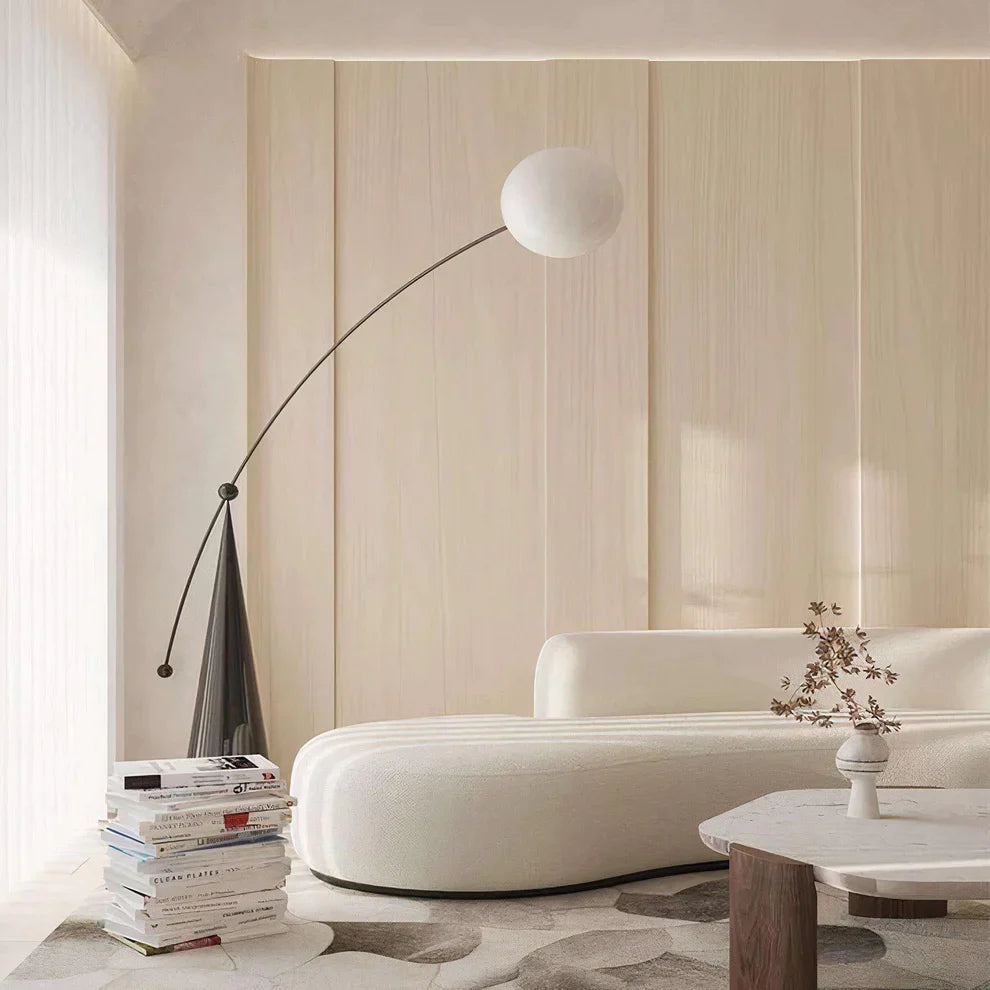
Living Room: Warm vs. Cool Tones
The living room serves as the heart of your home, where style meets comfort. This space often dictates the overall ambiance, making color selection crucial. Warm tones, like terracotta, mustard, and burnt sienna, create a cozy atmosphere, inviting relaxation and conversation. They pair beautifully with natural materials like wood and soft textiles, establishing a welcoming environment. Conversely, cool tones include shades such as soft blues, greens, and greys. These colors instill a sense of calm and spaciousness, ideal for modern and minimalist aesthetics. A cool palette can enhance natural light and create a refreshing backdrop for art and furniture. When choosing, consider the mood you want to set: warmth fosters intimacy, while coolness promotes tranquility. Mixing the two can produce harmony, balancing comfort and serenity. For instance, pairing a warm taupe with a serene sage green can create depth while maintaining a cohesive look. Balance is key; vary the shades in different elements like cushions or wall art to tie the room together seamlessly.Bedroom: Calming Neutrals and Soothing Pastels
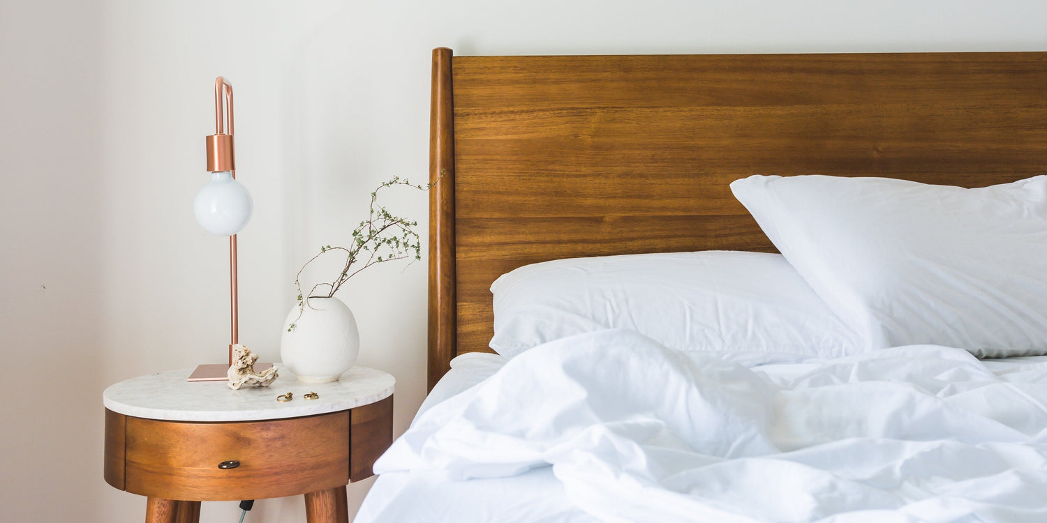
Your bedroom should evoke peace and relaxation, making color choice pivotal to achieving this. Calming neutrals such as soft whites, taupes, and greys provide a serene backdrop, promoting restful sleep. These hues can be enhanced with varying textures and layers, contributing to a cozy sanctuary. Pastels are another excellent option for bedrooms. Soft pinks, mint greens, and baby blues bring a gentle vibrancy without overwhelming the senses. These colors can add warmth and liveliness, offering the perfect balance between comfort and style. Layering these neutral or pastel shades can create a tranquil atmosphere. Consider a pale grey bedspread, complemented by blush pink cushions and light wooden furniture. This combination fosters a soothing environment conducive to relaxation and restoration.Kitchen: Vibrant and Inviting Colors
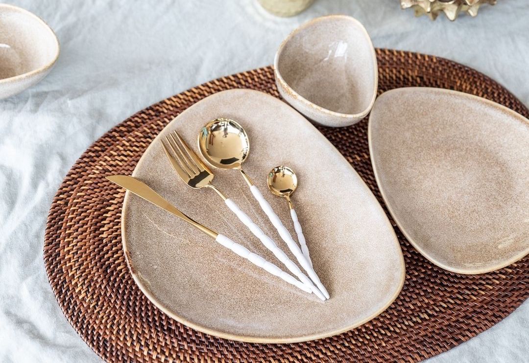
The kitchen is often viewed as the social hub of the home, making colorful palettes particularly impactful. Vibrant colors like cheerful yellows, rich reds, and lively greens can invigorate the space, stimulating appetite and conversation. A sunny yellow can brighten cabinets, while a bold red may serve as a striking accent on walls or appliances. Mixing vibrant shades with white or light neutrals can balance the energy while maintaining brightness. For example, deep green kitchen cabinets, paired with white countertops, can evoke a refreshing botanical feel, perfect for modern living. Open shelving offers an opportunity to introduce color through decorative dishes, glassware, and plants. These elements can echo the kitchen’s overall palette while adding personality, creating an inviting atmosphere for gatherings. Choosing the right color palette for your kitchen will depend on the size and layout. A smaller kitchen may benefit from lighter shades, while a larger space can embrace bolder tones without feeling cramped. Experimenting with color schemes can lead to a truly unique culinary environment.
Complementary Color Schemes
Understanding Complementary Colors
Complementary colors are positioned opposite each other on the color wheel, creating a vibrant contrast that can energize or balance a space. Utilizing these pairings can enhance visual interest and establish focal points in your home décor. The interplay of complementary colors draws the eye, making rooms feel dynamic and well-curated. Choosing the right complementary scheme allows for varied expressions, fitting both modern and classic aesthetics seamlessly. When executed thoughtfully, these combinations evoke balance and harmony while simultaneously enriching the overall ambiance.Popular Pairings
Among the myriad of complementary combinations, a few stand out:Blue and Orange
This lively pairing exudes versatility. Blue invokes calmness, while orange offers warmth and energy. When merged, these colors can transform a living area or creative space into something both inviting and invigorating. For instance, a deep navy sofa harmonized with vibrant orange accent pillows creates a refined contrast that holds visual intrigue. Consider incorporating this duo through artwork or decorative accents. Adding blue-toned textiles alongside hints of orange in vases or wall art can achieve an effortless balance.Red and Green
Red and green evoke an energetic yet timeless appeal, often celebrated during festive seasons but perfect for year-round inspiration. Red, a color of passion and warmth, when paired with the cool essence of green, strikes an immediate chord of vibrancy and life. Integrate this combination by selecting muted shades—like olive green and burgundy—for a sophisticated twist. This enables the colors to enhance each other without overwhelming a space. Use red for accent walls or furniture pieces, complemented by green decor items like plants or cushions to maintain an airy feel.Executing the Perfect Combination
For an effective application of complementary colors, consider the following strategies: 1. **One Dominant Color**: Choose one color to dominate the space while allowing the complementary hue to accent. This creates a sophisticated balance that feels intentional and well-thought-out. 2. **Textures and Patterns**: Introduce various textures and patterns to soften the contrast. For example, pair a bold blue wall with subtle orange patterns in textiles to create depth. 3. **Accent Items**: If you're hesitant about large splashes of color, start small. Use complementary colors in accessories—cushions, rugs, art pieces—to gauge your comfort level.Additional Color Pairings
Other complementary combinations can also yield stunning results.Purple and Yellow
Purple's depth combined with the cheerfulness of yellow creates a balanced vibrance ideal for creative spaces or children’s rooms. This combination can invoke playfulness when used in artwork and décor. A soft lavender against bright yellow accents can maintain energy while preserving an inviting warmth.Pink and Green
Soft pink tones paired with various shades of green can create a serene environment that promotes relaxation, perfect for bedrooms or reading nooks. This combination plays well with natural elements, and it harmonizes beautifully in spaces filled with sunlight.Conclusion of Color Impact
Embracing complementary color themes can significantly impact any room's aesthetic appeal while offering a canvas for personal expression. By dissecting the emotional ramifications of each pairing and using them thoughtfully, your home can reflect an effortlessly chic vibe that embodies the Scandinavian sense of style—minimal, yet vibrant and engaging.
Trendy Color Combinations for 2023
Current Color Trends in Home Décor
As we embrace 2023, a fresh wave of color trends is shaping home interiors. Minimalism paired with bursts of vibrant hues is prevalent, highlighting the growing preference for emotional and striking aesthetics. Earthy tones mixed with lively accents are gaining traction, reflecting a deeper connection to nature and personal well-being. Bold and rich hues dominate the palette, moving beyond the neutrals that have long characterized Scandinavian design. Homeowners are now enjoying the sophisticated yet playful combinations that create harmony and excitement in their spaces.Examples of Modern Color Pairings
Emerald Green and Gold exemplify luxury and depth. This combination brings a regal quality to any room. Emerald's richness provides a refreshing contrast to gold’s warm metallic tones, perfect for living rooms or accent walls. Utilizing these colors together can effortlessly elevate the ambiance, creating an inviting yet opulent atmosphere. Blush Pink and Grey offer a softer, contemporary approach. Blush serves as a delicate base that evokes a sense of calmness, while grey adds a modern edge. This pairing works beautifully in bedrooms or serene spaces, allowing for an exquisite balance between warmth and tranquility. Terracotta and Soft White is trending this year, merging rustic charm with modern minimalism. The subtle warmth of terracotta contrasts elegantly against crisp, soft white, creating a grounded yet airy feel. This duo is ideal for kitchens or dining areas, inviting a sense of coziness without overwhelming the senses. Navy Blue and Mustard Yellow present a striking and energetic duo. Navy’s deep tones bring sophistication, while mustard introduces a bold pop, perfect for an accent piece or focal point. This combination is well-suited for vibrant living spaces where creativity thrives. Dusty Blue and Taupe have emerged as a tasteful blend of calm and earthiness. Dusty blue provides a serene backdrop, while taupe adds warmth and depth. This sophisticated pairing is excellent for creating serene bedrooms or peaceful study areas, promoting a soothing environment. Lilac and Sage Green are gaining popularity for their soft, nature-inspired appeal. This delicate duo brings a fresh yet calming atmosphere, perfect for spaces like nurseries or light-filled living rooms. Lilac's subtle vibrancy pairs beautifully with sage's muted elegance, reflecting a tranquil yet cheerful vibe. Charcoal and Blush appeal to those seeking contemporary elegance. Charcoal's deep sophistication contrasts elegantly with blush's gentle touch. This sophisticated blend can transform a casual space into a chic haven, suitable for modern dining rooms or intimate nooks. Coral and Teal provide a vibrant, tropical vibe, ideal for energizing spaces. The lively coral balances well with teal's boldness, creating a dynamic and inviting atmosphere. This combination flourishes in sunlit areas, perfect for cheerful sunrooms or vibrant home offices. Forest Green and Cream emerge as a grounding yet fresh pairing, bringing nature indoors. Forest green exudes calmness, while cream softens the visual impact, enhancing natural light. This duo is perfect for living spaces, offering a refreshing retreat from the busyness of daily life. Integrating these trendy color combinations into your home not only updates your décor but also reflects personal style and taste. Each pairing serves a unique purpose, catering to various atmospheres and moods.
Choosing the right color combinations for your space is crucial in creating a cohesive and inviting atmosphere. Start with an assessment of your personal style. Consider what resonates with you—be it minimalism, bohemian, or industrial aesthetics. Your choice of colors should reflect your personality and evoke the feelings you want your home to inspire.
Next, evaluate your existing décor. If you already have cornerstone pieces like a statement sofa or artwork, pull colors from these elements to create a harmonious look. This method ensures that your new color palette complements rather than clashes with your current setup.
Utilizing color wheels and swatches can significantly aid in making your decisions. Color wheels help identify relationships between colors, such as analogous, complementary, and triadic schemes. By exploring these relationships, you can create visually appealing combinations. Swatches are particularly handy; they allow you to test how colors look together in your own space under different lighting conditions.
Lighting plays a pivotal role in how colors are perceived. Natural light can change the appearance of shades throughout the day, while artificial lighting can create entirely different moods. Test your color combinations at different times of the day to see how they interact with your lighting. Warm bulbs enhance yellows and reds, while cooler lights accentuate blues and greens. Aim for a balance that aligns with your desired ambiance.
To create a polished look, it’s essential to maintain a consistent tone throughout the space. If you prefer a calm, minimalist aesthetic, opt for soft neutrals and pastels. For a more vibrant energy, integrate bolder hues as accent colors. This ensures that the palette doesn't overwhelm the senses, inviting a sense of tranquility or energy depending on your choice.
Don’t shy away from experimenting. Use removable paint samples or fabric swatches to visualize how different combinations will appear together. This tactile method can inspire confidence in your final selections. Remember, the right combination can transform a room, making it feel larger, cozier, or more dynamic based on how the colors interact.
Keep in mind the psychology of colors—while blues promote calmness, yellows can energize. Consider the function of each room and how you want to feel in those spaces. A serene bedroom might benefit from soft blues or greens, while a lively kitchen could embrace warm yellows or reds for a welcoming atmosphere.
Lastly, don’t forget about textures and materials. The way colors interact with different finishes can enhance or diminish their impact. For instance, matte and glossy surfaces can reflect light and influence the overall mood. Incorporating various textures can add depth to your color palette, ensuring it feels rich and engaging.
In wrap-up, choosing the right color combinations involves understanding your personal style, assessing existing décor, and considering the influence of lighting. Use tools like color wheels and swatches to refine your choices, and don't hesitate to test different combinations to discover what resonates with your vision for the space.
Color is more than just a visual element; it shapes our experiences and influences our emotions. As we've explored various color combinations, it's clear that the right palette can transform a space into a serene retreat or a vibrant gathering spot. By selecting colors that resonate with your personal style and harmonize with your surroundings, you create an inviting atmosphere that enhances the overall aesthetic of your home. The suggested palettes for specific rooms bring functionality and visual appeal to the forefront. Whether you embrace the warmth of cool tones in the living room or the calming effect of pastels in the bedroom, the right choices can elevate your home décor to new heights. Additionally, understanding complementary colors allows for striking contrasts that add depth and energy to any setting. As we navigate the trends of 2023, innovative pairings like Emerald Green with Gold exemplify the bold directions in contemporary design. These combinations invite exploration and experimentation, empowering you to express your individuality. When selecting colors, consider practical aspects such as existing décor and lighting. Take the time to evaluate how different shades interact within your space, using tools like color wheels to make informed decisions. Ultimately, color is a powerful tool in home décor, transforming not only the aesthetics but also the mood of your space. Embrace the possibilities, and let your home reflect your unique vision through the art of color.